PostHog Didn't Find Bugs. It Found My Wrong Assumptions
Sentry told me when GuideFin broke. PostHog told me something harder to hear: a working app isn't the same as a used app. Two Different Questions I've written…
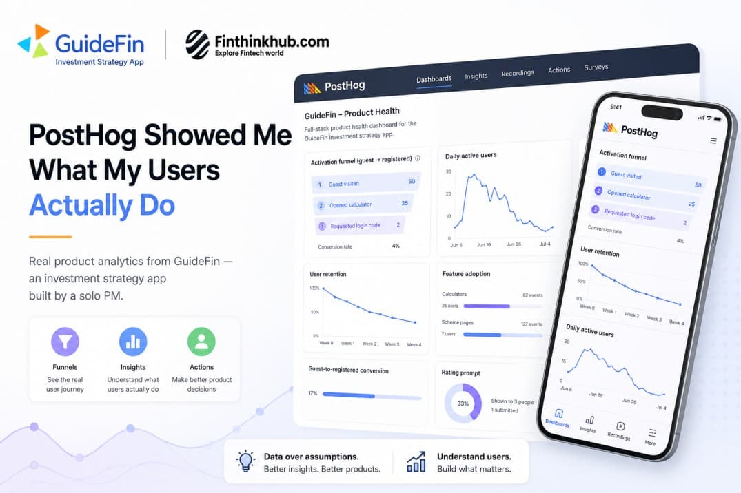
Sentry told me when GuideFin broke. PostHog told me something harder to hear: a working app isn't the same as a used app.
Two Different Questions
I've written before about how sentry made me better PM. Sentry answers one question: is the app broken? It's great at that. But it has nothing to say about a scarier question: does anyone use this, and do they get anywhere with it?
That second question is what PostHog answers. GuideFin is an investment strategy app I built alone, with no Dev and QA team. Sentry told me the app wasn't crashing. It couldn't tell me whether people who tried the "goal planner" feature ever finished setting up a goal or whether guests who explored the app ever became real users. For that I needed product analytics: a tool that watches what people do, not just what breaks.
GuideFin is a React Native app, so mobile analytics had to work the same way across Android without slowing anything down. Setting up PostHog's React Native analytics SDK was the easy part. Deciding what to track, and what to leave alone, took longer.
Below are the real charts from my PostHog dashboard, explained in plain terms. Some of them surprised me.
The Funnel That Proved Me Wrong
GuideFin has a "guest mode." You can try the calculators without signing up first. It felt like a friendly idea, let people try the app before asking for their email. I assumed most guests would like it and sign up eventually.
The way to check that assumption is a product funnel: a step-by-step view of how many people make it from one action to the next. Here's what the activation funnel actually looks like, step by step, over the last 30 days:

Half of guests open a calculator. That part is healthy. But almost none of them go on to ask for a login code. Out of 25 people who used a calculator, only 2 ever tried to sign up. A longer, 90-day view tells the same story:
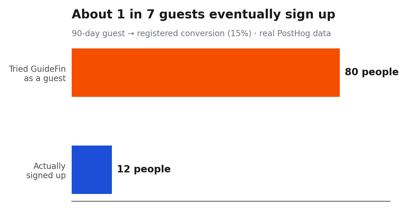
About 1 in 7 guests ever becomes a registered user. Nothing here is a bug. No crash, no error. Sentry would never catch this, because nothing broke. It's just a fact about how people use the app, and it wasn't what I expected.
What changed for me: I stopped treating sign-up as the finish line. Plenty of people get real value from GuideFin's calculators without ever registering. That's fine. The goal now is to make the guest experience good on its own, not just a path toward an account.
The Chart That Was Lying to Me
This one surprised me the most. While going through my dashboard, I found two charts measuring almost the same thing, user retention: how many users come back week after week. They told two different stories.
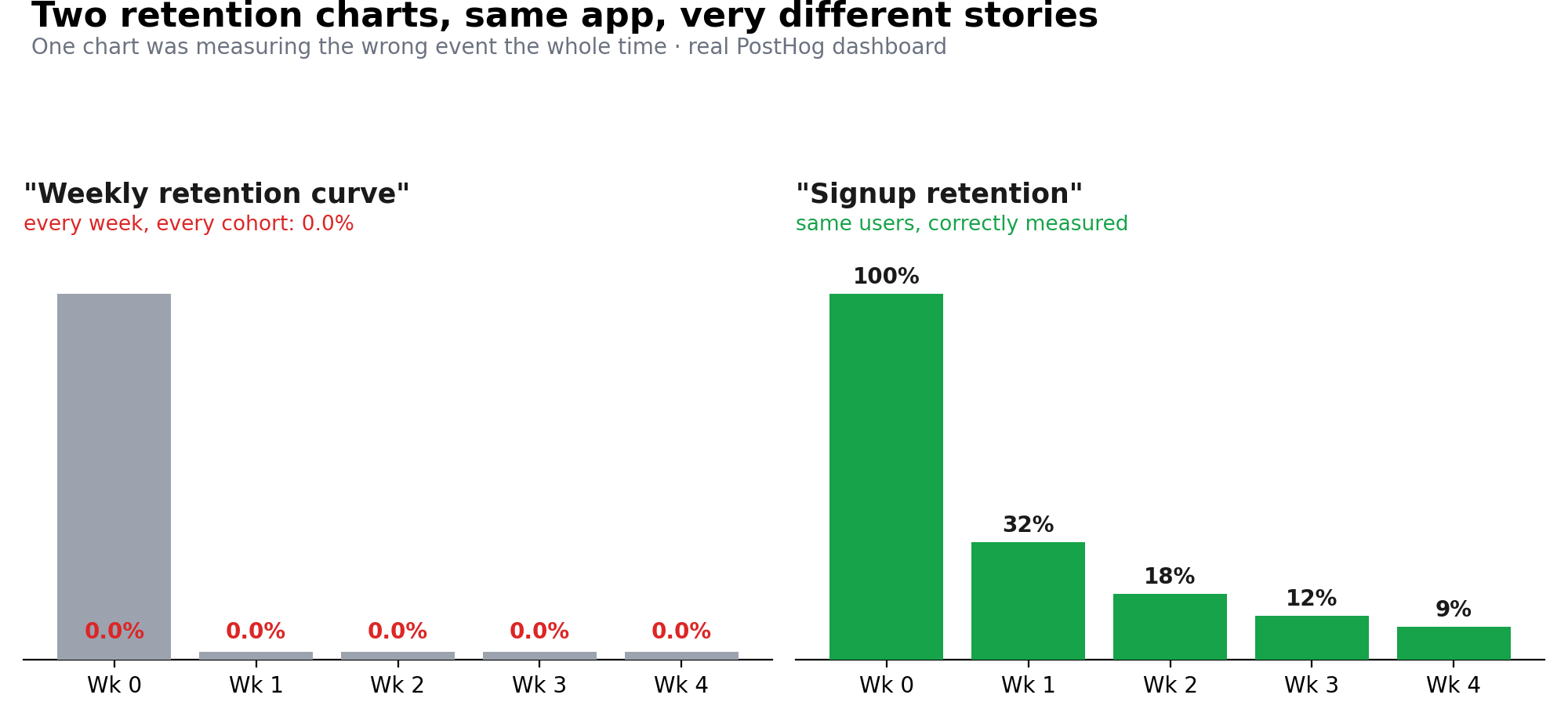
The chart on the left, "Weekly retention curve," showed 0.0% every week, for every group of users, for two months straight. If I'd trusted it, I would have panicked. It looks like nobody ever comes back to the app. But the chart on the right, built from the same users and measured properly, shows a normal pattern: everyone's there in week 0, and a good number are still around weeks later.
The left chart wasn't broken in a way that threw an error. It just measured the wrong thing. My best guess: it was set up to count a web-style event that GuideFin, a mobile app, never sends. It looked exactly like bad news. It was really just a setup mistake.
The lesson: a chart showing a flat zero isn't proof that something's wrong with your product. It might mean something's wrong with the chart. Now, before I trust a scary number, I check it against a second chart built a different way.
Where People Actually Spend Their Time
This is a feature adoption chart. It compares two things for each feature: how many different people tried it, and how many times it got used in total.
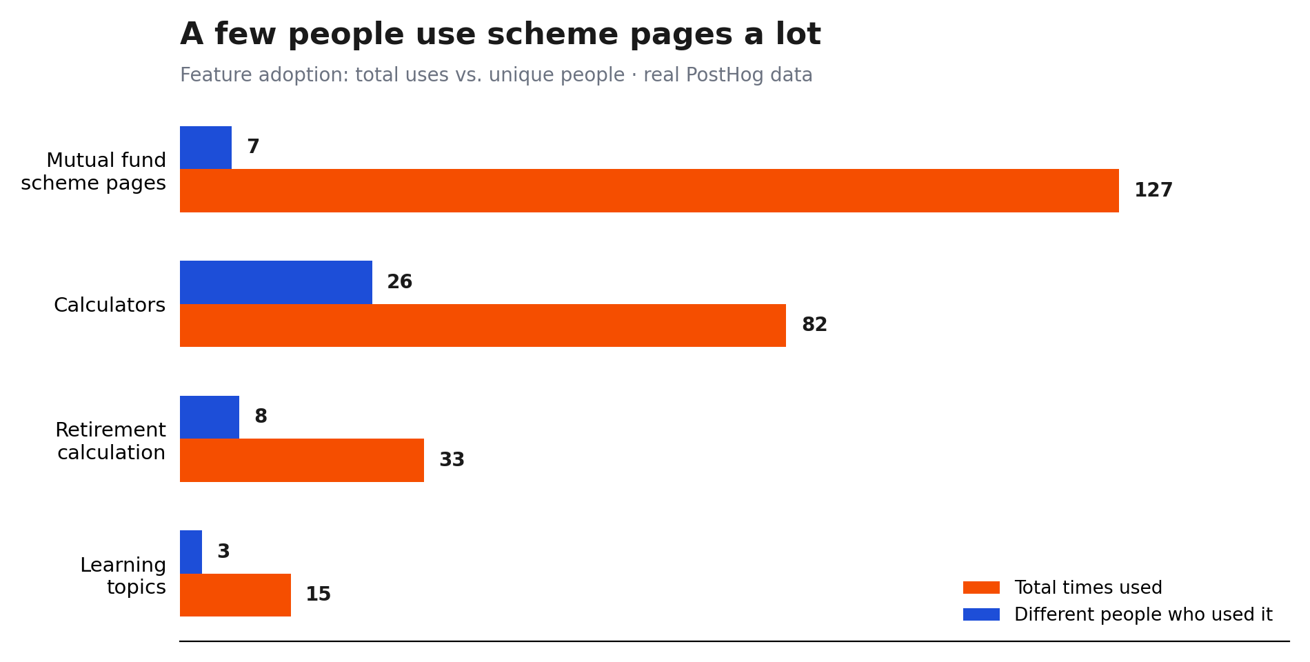
These are two different shapes of use, and they call for two different decisions. Mutual fund scheme pages get used a lot, but only by a small group of people. That's a feature for a few dedicated users, worth investing in for them. Calculators are the opposite: lots of different people try them once. That's a front-door feature, the thing people bump into first, so it needs to stay simple.
Small Numbers Are Still Honest Numbers
GuideFin doesn't have a marketing budget, so the daily user count looks exactly like you would expect for a small, solo-built app:
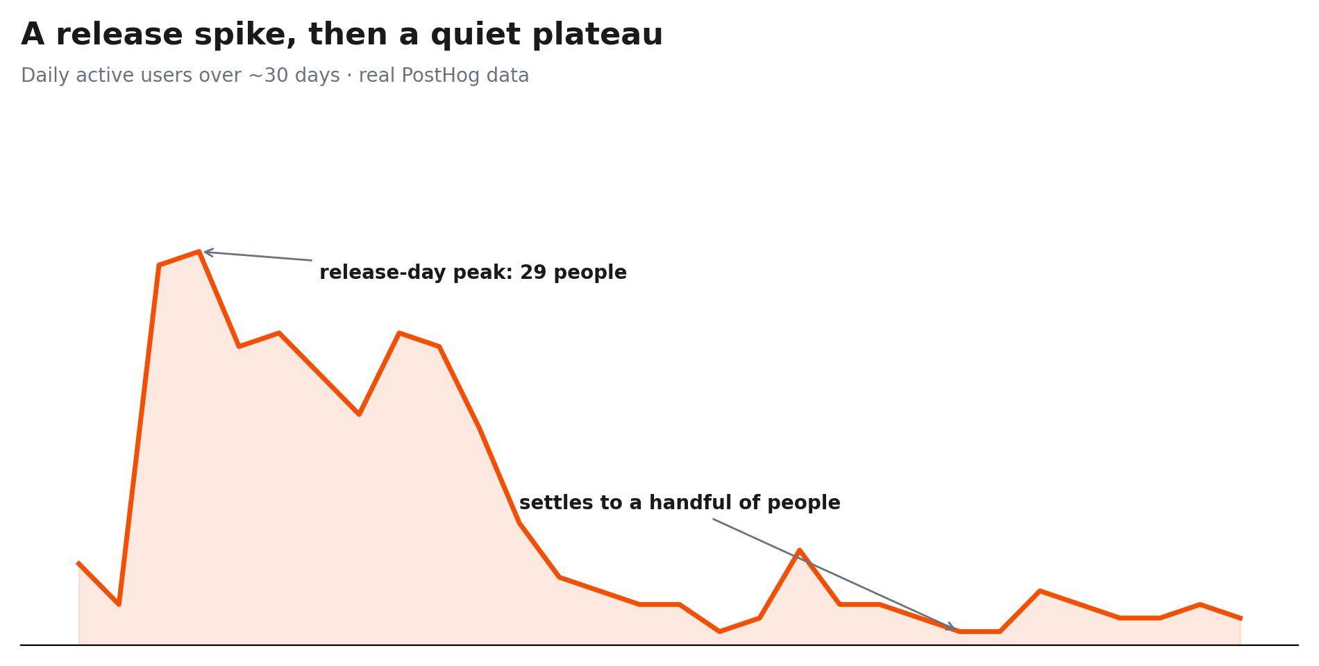
A release brings a burst of activity, then it settles back down to a small, steady group of regulars. It's easy to look at a line that drops from 29 to single digits and feel discouraged. But this is the honest shape of a real, early product, and honest small numbers beat a vanity metric that hides what's really going on.
A Rating Prompt That Asks at the Right Moment
The best thing I've built with PostHog isn't a chart. It's a small popup that asks happy users to rate GuideFin on the Play Store. What makes it work is when it appears.
Most apps ask for a rating on a timer, something like "you've had the app open for 30 seconds, rate us!" That's the wrong moment; you haven't done anything yet. Mine only fires right after someone finishes something that took effort: saving a savings goal, or saving a full retirement plan. That's just event tracking, two lines, placed where those actions finish:
trackEvent('goal_saved', { mode: 'authed', ... });          // after a goal is saved
trackEvent('retirement_plan_saved', { is_update: !!prev }); // after a plan is saved
Everything else about the prompt (the wording, who sees it, how often) is set up inside PostHog itself, not in the app's code. That matters because it means I can change the message or the timing without shipping a new version of the app to the Play Store.
Fifteen days in, here's how it's doing:
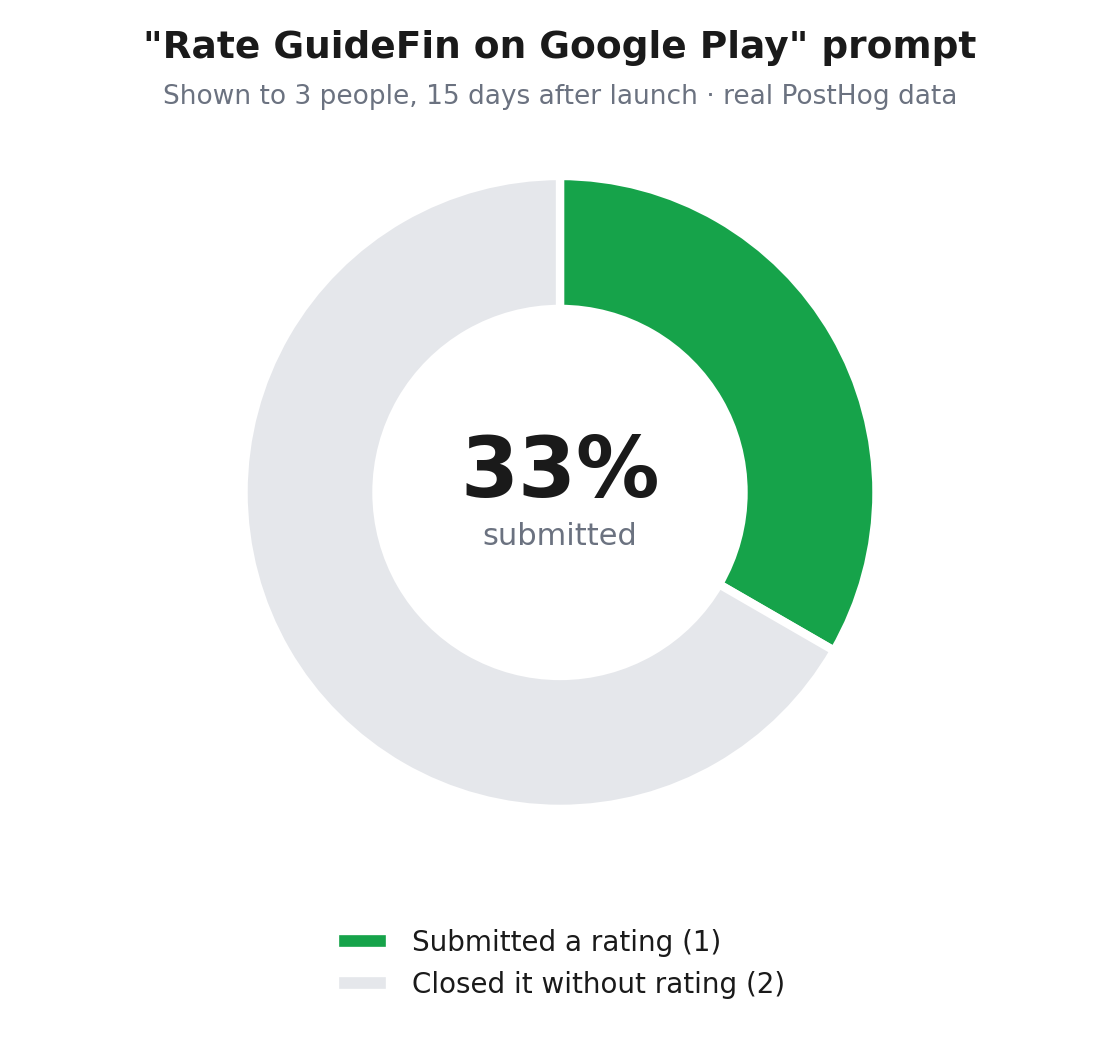
Three people, one rating. Tiny numbers, exactly what you'd expect this early. I'm not sharing that as a success story. I'm sharing it because I've already changed the wording and the timing twice since launch, and neither change needed an app update. That's the real win.
What I'd Tell Any Solo Builder
This is product management with no product team: just you, a dashboard, and whatever it tells you. "Is it broken" and "does anyone care" are different questions. You need a different tool for each. A clean Sentry dashboard tells you nothing about whether people use what you built.
Trust a funnel over your gut. I assumed most guests would sign up eventually. The data said otherwise, and it was more useful than my assumption ever was.
A flat, scary-looking chart deserves a second look before you panic. Check it against a different chart measuring the same thing before you believe it.
Ask for feedback right after a win, not on a timer. A prompt tied to "the user just did something that mattered" beats one tied to "the app has been open a while."
Thanks to PostHog, for the funnel that proved a wrong assumption wrong, and for a rating prompt I've tweaked twice without a single app release.
GuideFin is a personal finance app built with React Native, Expo, and Supabase. Sentry and PostHog together are the closest thing a solo PM has to a real product team.
Try GuideFin: Download on Google Play

Responses (0)
Leave a response
Related Articles
GuideFin: A Real Plan Not Just Another Investment App
Why the middle class Indian investor doesn't need another place to invest. They need a clear plan, and an honest way to …

What Happens When You Send Money on UPI: A Complete Breakdown
You send ₹1,000 to Tarun who is your colleague in Noida on UPI. Your phone buzzes, the app shows a green tick, "Payment …

How Invoice Discounting Apps Are Growing in India
Most Indians learn investing in the same order: 1st savings account, then FD, then mutual funds and SIPs, then maybe NPS…